That’s because the most widely used world map—the Mercator projection—shrinks Africa and inflates regions like Europe and North America. Now, the African Union is backing a campaign to fix this distortion and restore Africa’s true scale.
The Problem with the Mercator Map
-
Invented in 1569 by Gerardus Mercator, the Flemish cartographer, the map was a game-changer for sailors during the Age of Exploration. It let them plot straight-line routes across the seas without constantly adjusting their compasses.
-
But here’s the catch: while the shapes of countries are preserved, their sizes are grossly distorted.
-
On the Mercator map:
-
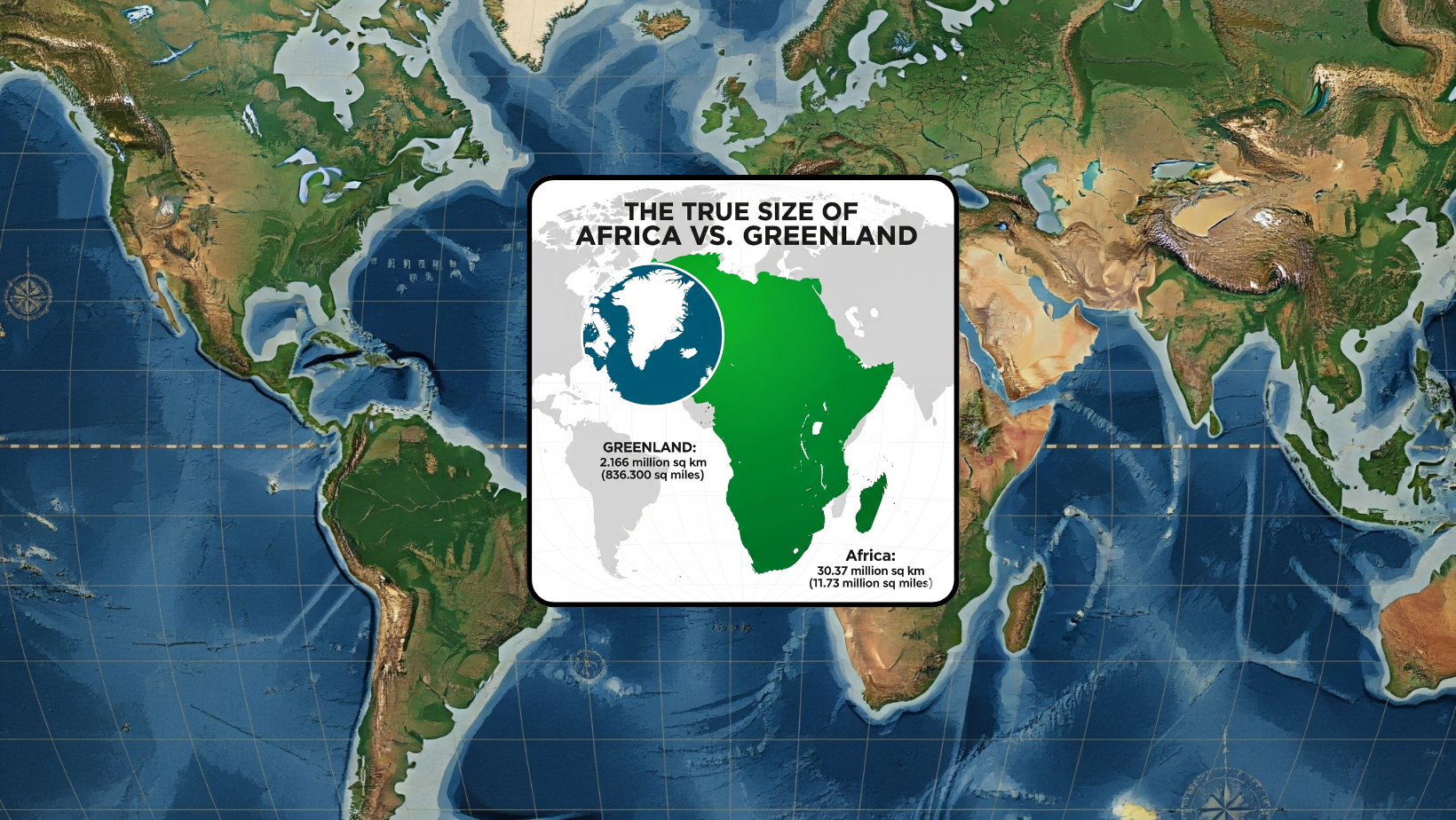
Africa looks about the same size as Greenland.
-
In reality, Africa is 14 times larger!
-
The U.S., China, India, and much of Europe could all fit into Africa—with room to spare.
-
Why It Matters
“It might seem to be just a map, but in reality, it is not,” said AU Commission Deputy Chairperson Selma Malika Haddadi.
When maps misrepresent Africa’s size, it also distorts global perception—affecting education, policy, and even how Africa’s importance is viewed on the world stage. A smaller-looking Africa has historically aligned with colonial narratives that downplayed its power, resources, and potential.
The Alternative: Equal Earth Map
Enter the Equal Earth map, created in 2017 by Tom Patterson and colleagues.
-
Unlike Mercator, this projection is an equal-area map: it shows the true relative size of countries and continents.
-
Yes, the shapes look a little stretched and wobbly—but the scale is finally accurate.
-
Institutions like NASA, National Geographic, and the World Bank have already begun phasing out Mercator in favor of Equal Earth. Even Google Maps made Mercator optional in 2018.
Trivia & Fun Facts
-
Map Illusion: Ever seen those memes where Africa looks “tiny”? That’s Mercator tricking your brain. In truth, Africa covers 30.3 million km²—making it the second-largest continent after Asia.
-
Colonial Tool: Some historians argue Mercator’s popularity wasn’t just about navigation—it also visually “elevated” Europe and “shrunk” colonized regions.
-
Mind-Blower: If Africa were drawn to scale, it could swallow up the U.S., China, India, Japan, and most of Europe combined!
-
UN Pressure: Campaigners have urged the United Nations to officially endorse the Equal Earth map, but so far the UN hasn’t responded.
Why Change is Needed
Changing maps isn’t just cartographic housekeeping—it’s about representation, respect, and reality.
By promoting the Equal Earth map:
-
Students worldwide will grow up with a truer view of Africa’s size and influence.
-
Media, textbooks, and policies will reflect Africa’s real scale and potential.
-
The world begins to shift away from a Eurocentric perspective to one of balance and inclusivity.
Final Thought
Maps shape the way we see the world—and how we value it. By correcting the map, we aren’t just redrawing coastlines; we’re redrawing perceptions of power, opportunity, and respect for Africa.
Fun Wrap Line: Next time you see Greenland and Africa looking like equals on a classroom wall—remember, Africa is the true giant. The map just forgot to tell you.
Leave a Comment